


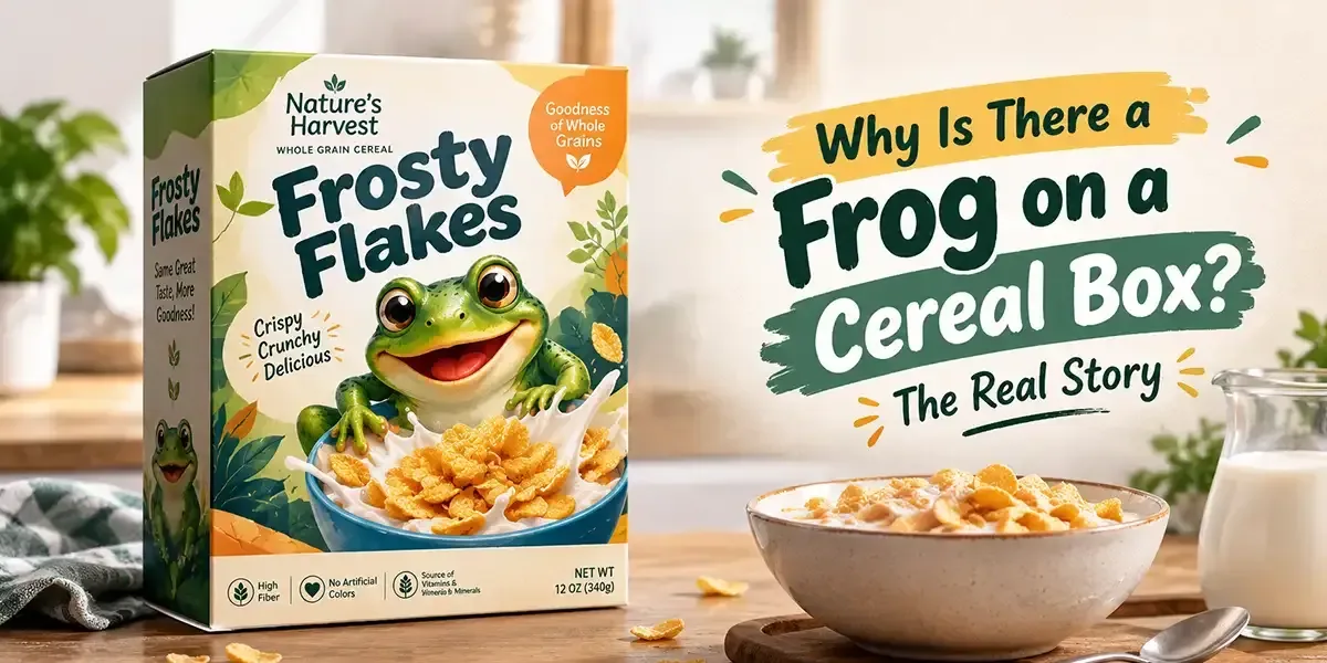
Why Is There a Frog on a Cereal Box? The Real Story
Discover how premium packaging transforms your brand's perception and drives customer loyalty in today's competitive market.
- Key Takeaways
- Mascot 101: Understanding the Role of Characters Behind Familiar Cereal Brands
- Learn How Kellogg’s Cereal Characters Evolved Before Dig’em Frog Became the Face of the Brand
- The Unexpected Story Behind the Green Frog That Became Kellogg’s Honey Smacks Icon
- What Made Dig’em Frog So Hard for Young Cereal Shoppers to Ignore
- A Comparative Look at Famous Cereal Mascots
- The Color Psychology Behind the Cheerful Look of Cereal Packaging
- Children’s Cereal Boxes vs. Adult Cereal Boxes: Two Very Different Design Approaches
- What Belongs on the Back & Sides of a Cereal Box After the Front Gets Attention?
- From an Unusual Character to a Familiar Face: The Bigger Story Behind the Frog
The frog on a cereal box is there to represent the brand and give the product a recognizable character. On Kellogg’s Honey Smacks, the character is Dig’em Frog, whose cheerful appearance helped give the cereal a distinctive identity on the shelf.
But why a frog?
Some brands use bold food imagery, while others add characters that become closely associated with the product.
But what makes these characters so effective? Why do some cereal brands use frogs, tigers, roosters, rabbits, or toucans instead of simply showing the cereal itself?
Before we uncover Dig’em Frog’s story, let’s take a closer look at the familiar characters behind food packaging and why brands put them there.
Let’s hop into the story!
Key Takeaways
- Dig’em Frog represents Honey Smacks, giving the cereal box a recognizable identity.
- Cereal packaging protects, presents, and informs, while helping products stand out.
- Brand characters improve product recognition when used consistently.
- Packaging design can influence shopper attention and product recognition.
- Cereal mascots vary by brand and audience, from frogs and tigers to roosters and rabbits.
Mascot 101: Understanding the Role of Characters Behind Familiar Cereal Brands
A mascot is a character, figure, or symbol created to represent a brand or product. It gives the brand a clear personality and helps people connect the character with the product. In cereal packaging, these characters can become familiar visual cues that help shoppers identify a product quickly.
For example, Cornelius Rooster is closely associated with Kellogg’s Corn Flakes. Its appearance on the Corn Flakes box gives the packaging a recognizable character beyond the cereal name and product imagery.
So, a mascot is not simply a cartoon added to make a package look fun. It can become part of how a product presents itself, especially when the same character appears consistently across packaging, advertising, and other brand materials.
Learn How Kellogg’s Cereal Characters Evolved Before Dig’em Frog Became the Face of the Brand
Kellogg’s did not find its famous frog on the first hop. When the company introduced Sugar Smacks in 1953, it experimented with different characters to give the cereal box a personality that could appeal to its young audience. Before Dig’em Frog arrived, the brand went through a surprisingly long lineup of mascots, each bringing a different personality to the cereal packaging.
The Evolution of Sugar Smacks Characters
Cliffy the Clown (1953)
↓
Smaxey the Seal (1957)
↓
Quick Draw McGraw (1961)
↓
The Smackin’ Bandit (1965)
↓
The Smackin’ Brothers (1966)
↓
Indian Chief (Early 1970s)
↓
Dig’em Frog (1972)
However, choosing a character was only the beginning. Kellogg’s was looking for a face that could give its cereal packaging a stronger identity and become closely associated with the product.
Dig’em Frog would eventually become that character, remaining associated with the cereal through its later transition from Sugar Smacks to Honey Smacks.
The Unexpected Story Behind the Green Frog That Became Kellogg’s Honey Smacks Icon
In 1972, Kellogg’s gave Sugar Smacks a fresh start by changing its name to Honey Smacks and partnering with the Leo Burnett advertising agency. The agency was brought in to help give the brand a new direction, and that is where art director James Mackey came up with an unusual idea: a cheerful green frog with a wide grin and a playful personality.
The character was named Dig’em Frog, inspired by the phrase “You’ll dig ’em!” The idea was simple, but the result was anything but forgettable. Dig’em gave Honey Smacks something the earlier characters had struggled to provide: a distinctive face that could appear across the brand’s packaging and advertising.
Suddenly, the cereal box had a character children could spot, recognize, and remember. The frog had officially found his place on the box, but the bigger question remained: why did Dig’em connect so well?
What Made Dig’em Frog So Hard for Young Cereal Shoppers to Ignore
Dig’em worked because he gave children something they could recognize before they even read the words on the box. His bright green color, wide grin, and playful appearance made him easy to find among rows of competing cereal packages. For a child walking through a grocery store with a parent, that familiar face could instantly draw attention.
But recognition was only part of the story. Children can develop familiarity with characters they repeatedly see in packaging and advertising, making the character feel connected to the product itself. So, when a child spotted Dig’em on the shelf, they did not necessarily see just another cereal box. They saw a familiar character attached to a cereal they already knew.
That connection could influence the grocery aisle in a very simple way: the child recognizes the frog, recognizes the cereal, and asks their parent for it.
The character became part of the choice, not just part of the box.
A Comparative Look at Famous Cereal Mascots
Cereal brands have used characters for years, and each one adds something different to the packaging. Looking at a few familiar faces shows how brands use animals, people, and imaginary characters to create a visual identity that shoppers can quickly associate with a product.
Character | Cereal Brand | Type | First Appeared | Key Feature |
|---|---|---|---|---|
Kellogg’s Rice Krispies | Elves | 1933 | Cereal sound connection | |
Tony the Tiger | Kellogg’s Frosted Flakes | Tiger | 1952 | Athletic, bold appearance |
Cornelius Rooster | Kellogg’s Corn Flakes | Rooster | 1957 | Classic rooster imagery |
Sonny the Cuckoo Bird | Cocoa Puffs | Bird | 1962 | Over-the-top excitement |
Toucan Sam | Kellogg’s Froot Loops | Toucan | 1963 | Distinctive colorful beak |
Cap’n Crunch | Cap’n Crunch | Human character | 1963 | Signature captain uniform |
Dig’em Frog | Kellogg’s Honey Smacks | Frog | 1972 | Bright green, playful look |
Buzz the Bee | Bee | 1979 | Honey-themed character |
These examples show that there is no single formula for a successful cereal character. The character's appearance, connection to the product, and overall presentation can help give each package its own visual identity. Dig’em Frog simply took a different route, turning a green frog into a recognizable part of Honey Smacks.
The Color Psychology Behind the Cheerful Look of Cereal Packaging
A character may catch the eye, but color helps set the mood of the entire cereal box. Children’s cereals often use bright, high-contrast colors to create a lively appearance and stand out in a busy aisle. The colors work alongside the character, illustrations, typography, and product images to create one clear visual impression.
Some common color associations include:
- Yellow - Cheerful, bright, and energetic
- Red - Exciting and attention-grabbing
- Blue - Calm and dependable
- Green - Fresh and natural
- Orange - Warm, lively, and playful
These associations are not universal. The surrounding colors, design, product category, and audience can all change how a color is perceived.
That is why packaging designers do not simply pick the brightest colors available. They choose combinations that fit the product, support its personality, and help attract the shopper without making the printed box packaging difficult to understand.
Children’s Cereal Boxes vs. Adult Cereal Boxes: Two Very Different Design Approaches
A cereal box designed for children and one designed for adults may appear on the same shelf, but they often use very different visual styles. The difference comes down to what each audience is most likely to notice and value when choosing a product.
Children’s Cereal | Adult-Focused Cereal |
Cartoon characters | Product photography |
Bright colors | More restrained colors |
Playful typography | Clean typography |
Games and activities | Nutritional information |
Fun product messages | Health and ingredient-focused claims |
For example, a strawberry-flavored children’s cereal might show bright strawberries, a playful character, and colorful cereal pieces to make the box feel exciting. An adult-focused cereal may show a bowl of cereal with real strawberries, grains, or other ingredients, alongside information about fiber, protein, or other nutritional benefits.
The packaging is essentially designed for two different decision-makers. A child may be drawn to the character and colors, while the adult is more likely to look at the information that helps them decide whether to buy it. This balance becomes especially important when designing cereal retail boxes, where the package has to communicate the product quickly from the shelf.
What Belongs on the Back & Sides of a Cereal Box After the Front Gets Attention?
Getting someone to notice the front of a cereal box is only the first step. Once a shopper picks it up, the rest of the packaging needs to give them useful reasons to keep considering the product. This is where the back and side panels become important.
Depending on the product and audience, these panels can include:
- Nutrition facts - Information about calories, sugar, fiber, vitamins, and other nutrients
- Ingredients - A clear list of what goes into the cereal
- Brand story - A short message that gives shoppers more context about the product
- Serving ideas - Recipes, preparation suggestions, or ways to enjoy the cereal
- Activities - Games, puzzles, or interactive content for children
- Promotions - QR codes, competitions, discount offers, loyalty rewards, or social media campaigns
The front may make someone stop, but the remaining panels help them understand what they are buying. Good cereal packaging gives every panel a purpose instead of treating the front as the only important space.
From an Unusual Character to a Familiar Face: The Bigger Story Behind the Frog
A frog on a cereal box may seem like a small design choice, but Dig’em Frog shows how a simple character can become part of a product’s identity. From mascots and colors to product imagery and essential information, every packaging decision can shape how shoppers see and remember a product.
If you are planning custom cereal packaging, these principles can help you create a custom box that fits your product and connects with your target audience. Depending on your product and requirements, packaging styles such as seal end boxes can also be considered.
Further, you can read our blog “Cereal Box Sides: A Complete Guide to Design, Dimensions, and Uses” to get useful insight.
At BoxLark, you can customize your cereal boxes with your preferred dimensions, artwork, printing, finishes, and other packaging specifications.
Reach out to the expert team at sales@boxlark.com to discuss packaging requirements, or place an order.