


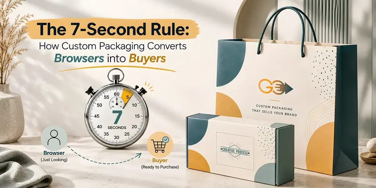
The 7-Second Rule: How Custom Packaging Converts Browsers into Buyers
Discover how premium packaging transforms your brand's perception and drives customer loyalty in today's competitive market.
- Key Takeaways!
- The Science of First Impressions: Why Do 7 Seconds Matter?
- What Packaging Features Can Capture Shopper Attention within 7 Seconds? Let’s Uncover the Key Factors
- From Attention to Engagement: What Makes Shoppers Pause and Explore Further?
- Common Custom Packaging Mistakes That Can Cost You the Prime 7 Second Window
- Wrapping Up!
Custom packaging influences a shopper’s buying decision within seconds by attracting attention, communicating product value, and creating a strong first impression. When customers scan a retail shelf or browse an online store, packaging has a good opportunity to stand out before their attention shifts to another product.
“Make First Few Seconds Count with BoxLark Packaging That Earns Attention!”
The 7-second rule highlights a short window of opportunity. It does not mean that every shopper makes a purchase decision in exactly seven seconds. Instead, it reflects how quickly customers are able to form initial impressions based on how a product is noticed and perceived.
For brands, understanding this short attention window helps turn packaging design from a simple protective layer into an important part of the buying experience.
In this blog, we’ll explore how custom packaging design captures attention, communicates value, and helps turn browsers into potential buyers.
Let’s get into it!
Key Takeaways!
- The 7-second rule highlights how quickly shoppers form an initial impression of a product.
- Custom printed packaging helps products capture attention before shoppers move on to another option.
- Packaging elements work together to help shoppers recognize, understand, and explore a product.
- Clear information and relevant trust signals reduce hesitation and build purchase confidence.
- Effective packaging moves shoppers from a quick glance to genuine product consideration.
The Science of First Impressions: Why Do 7 Seconds Matter?
In a busy retail environment or while browsing online, shoppers quickly filter what deserves their attention. Consumer psychology relies on visual and mental cues to form an initial impression, making those first few seconds important for packaging.
Several factors influence this quick response:
The Brain Filters Information Quickly
Shoppers cannot process every product detail at once. Their attention naturally focuses on cues that appear noticeable or relevant.
Familiar Elements Make Products Easier to Identify
Familiar colors, logos, and visual patterns help shoppers recognize a brand faster and make the product easier to evaluate.
Novelty Interrupts the Visual Pattern
A package that looks different from surrounding products breaks the visual pattern and encourages shoppers to pause and look closer.
These factors explain why the 7-second window matters and set the stage for the packaging choices that follow.
What Packaging Features Can Capture Shopper Attention within 7 Seconds? Let’s Uncover the Key Factors
Once a package earns attention, shoppers begin processing its most noticeable design elements. These details work together to communicate what the product is, who makes it, and what kind of experience customers may expect.
Color Creates the First Visual Cue
Colors help a package stand out while setting an immediate visual tone. Distinctive custom packaging colors support product and brand recognition and shape expectations about the product. Contrast also matters because important information needs to remain easy to notice.
For example, a plain brown kraft box may appear simple, while a carefully chosen single color box in red, pink, or another distinctive shade develops a stronger visual identity. A balanced color palette makes the package noticeable without making the design feel crowded.
Color can influence:
- Initial visual attention
- Brand recognition
- Product perception
- Emotional expectations
Typography Makes Product Easier to Recognize
Typography determines how quickly shoppers identify the brand and product name. Font style, size, spacing, and placement all affect readability. A clear hierarchy helps customers understand which information matters most, while overly decorative or crowded typography makes the package harder to scan.
For example, white or yellow text on a custom black mailer box creates strong contrast, making the brand name and product information easier to notice. In comparison, dark gray text on the same black surface could become difficult to read quickly.
Key typography elements include:
- Brand name
- Product name
- Font style
- Font size
- Information hierarchy
Graphics Show What the Product Offers
Images, illustrations, patterns, and icons communicate product information without relying entirely on written text. They suggest a product's category, flavor, or function. A focused graphic creates interest, while too many competing visuals may distract shoppers from the main message.
For example, a skincare box showing an illustration of its main botanical ingredient helps shoppers understand the product category without requiring a long description.
Packaging Shape Creates a Physical Point of Difference
The structure of custom packaging makes a product noticeable before shoppers examine its printed design. Gable boxes, round boxes, and heart shaped boxes create a visual difference from standard rectangular packaging.
In contrast, distinctive proportions, opening styles, and structures such as magnetic boxes or 2 piece boxes make the package more interactive.
Packaging Materials Influence Product Perception
Packaging materials shape how shoppers perceive both the product and brand, while eco-friendliness may also influence their choice. As environmental awareness grows, excessive plastic can feel less appealing, whereas Kraft paper or cardboard creates a more responsible, quality-focused impression.
For example, durable kraft bags provide reliable product protection while giving orders an eco-friendly appeal.
Finishing Details Encourage a Closer Look
Finishing techniques add visual and tactile details that become more noticeable when shoppers examine the package closely. Embossing, debossing, foil stamping, and spot UV coating highlight selected areas without overwhelming the entire design.
For example, a raised logo or foil-stamped product name on a custom luxury box draws attention to one specific area, creating a refined look.
Finishes can highlight:
- Logos
- Product names
- Patterns
- Borders
- Key design details
Branded Elements Build Recognition
Consistent logos, colors, typography, and other visual identifiers make products easier to recognize across a product range. Familiar branding also helps customers connect the package with previous experiences, making recognition faster.
For example, a custom box with logo makes the brand instantly recognizable, especially when its placement and colors remain consistent across different products.
Summary: How Custom Printed Packaging Elements Work Together
Effective packaging gives each feature a clear purpose, creating a visual path that shoppers are able to process quickly.
Packaging Elements | Main Role | Shopper Response |
Color | Attract attention | Notices the package |
Typography | Present information | Understands the message |
Graphics | Communicate visually | Develops interest |
Shape | Create distinction | Remembers the package |
Materials | Influence quality and eco-friendliness | Shapes brand perception |
Finishes | Add visual or tactile detail | Examines the package more closely |
Branding | Build recognition | Connects with the brand |
Together, these elements guide the shopper through a simple visual journey:
Notice → Recognize → Understand → Explore
From Attention to Engagement: What Makes Shoppers Pause and Explore Further?
Getting noticed does not automatically create buying interest. Once a shopper gives the package a second look, the focus shifts from visibility to relevance.
Make the Product Easy to Understand
The package should quickly establish what the product is and what the shopper can expect from it. A clear product name, concise description, relevant information, and logical information hierarchy make this easier.
Shoppers should be able to identify:
- What the product is
- What category it belongs to
- What its main purpose is
Show Why the Product Is Worth Considering
After understanding the product, shoppers begin evaluating its perceived value. Packaging supports this stage through its product presentation, materials, and overall finish.
The important point is consistency. Packaging should make a promise that the product itself can support.
Create Curiosity Without Creating Confusion
Packaging encourages further exploration by giving shoppers something interesting to discover. A product window, special opening style, or short message creates curiosity and improves the customer experience.
For example, custom-printed packaging uses a short message or hidden design detail inside the packaging to give customers something to discover after the initial purchase interest has formed.
However, curiosity works best when the main product message remains clear. The package should make shoppers want to know more, not leave them wondering what the product actually is.
Turn Quick Attention Into Consideration
At this point, the shopper's response is viewed as a simple flow:
Stage | Shopper's Question | Packaging's Role |
Attention | What caught my eye? | Earn the first look |
Understanding | What is this? | Communicate the product |
Relevance | Is this for me? | Present useful information |
Value | Is it worth considering? | Support the product's positioning |
Curiosity | What else should I know? | Encourage further exploration |
For example, a bakery using custom cake boxes combines recognizable branding, an appealing visual style, and a clear product presentation to make the package feel worth a closer look.
Once interest has been created, the next challenge is reducing the doubts that stop a shopper from moving forward!
Common Custom Packaging Mistakes That Can Cost You the Prime 7 Second Window
A package may look attractive and still lose a shopper if its message is unclear or the design feels overwhelming. Avoid these common mistakes that might stop a product from moving beyond the first glance.
Packaging Mistakes | What Goes Wrong | Better Approach |
Too much information | Shoppers struggle to find the main message | Prioritize essential information and move extra details |
Poor readability | Small text, weak contrast, or difficult fonts slow down scanning | Use clear typography and strong visual contrast |
Generic design | The package blends into similar products | Add a recognizable point of difference |
Too many design effects | Colors, graphics, and finishes compete for attention | Give each design element a clear purpose |
Hidden branding | Shoppers may remember the package but not the brand | Keep key brand identifiers easy to recognize |
Inconsistent presentation | Different products may look disconnected from the same brand | Maintain consistent visual identity across the product range |
The goal is not to make packaging as visually loud as possible. It is to make the most important message easy to notice and understand before the shopper's attention moves elsewhere.
Wrapping Up!
Think of custom packaging like a shop window. A passerby may only glance at it for a few seconds, but that quick look decides whether they keep walking or stop to look closer. The 7-second rule is not about making every shopper buy instantly. It is about using those first moments wisely.
Strong visual appeal earns attention, while clear information, relevant value, and trust can help turn that attention into genuine consideration.
If your packaging is being overlooked or failing to communicate your product's value, it may be time to rethink. With years of experience in the packaging industry, BoxLark helps brands create packaging that captures attention, strengthens product presentation, supports sales, and contributes to a stronger return on investment.