


What Are the Colored Dots on Food Packaging? The Real Truth Explained
Discover how premium packaging transforms your brand's perception and drives customer loyalty in today's competitive market.
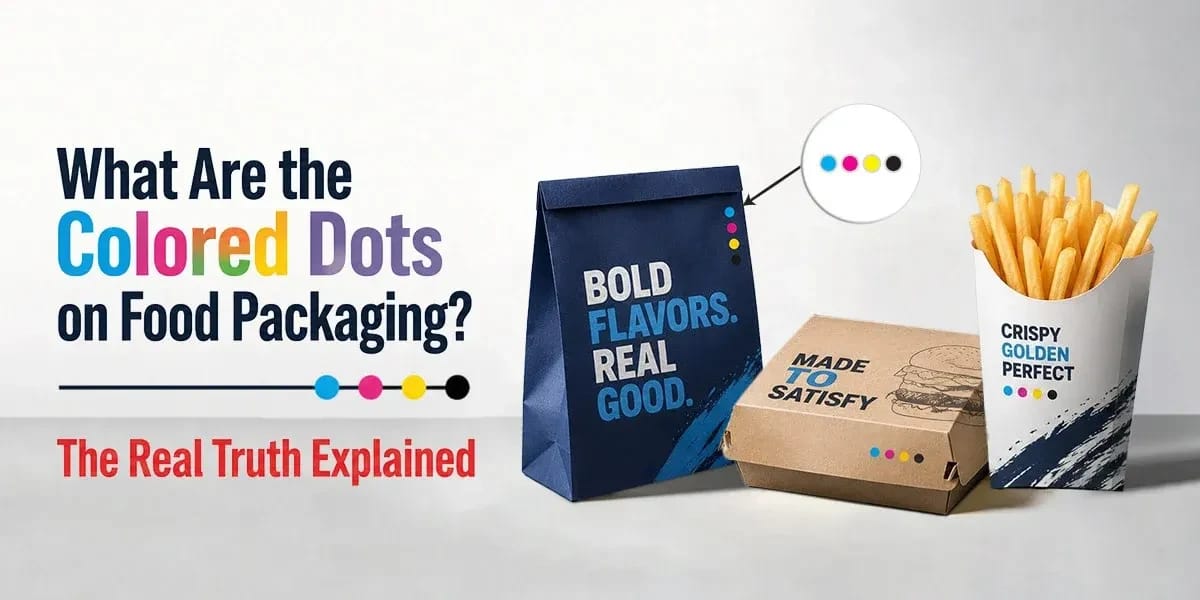
- The Simple Explanation: What Are These Colored Dots?
- The Impact of Color Consistency on Custom Food Packaging Appearance
- Understanding the Variety of Dots on Custom Food Packaging
- Why Do These Dots Matter to Packaging Companies?
- How These Dots Help Customers Buy the Product
- The Final Verdict on Food Packaging Dot Prints
Have you ever picked up a box of cereal, a bag of chips, or a frozen food bag and noticed a strange row of colored circles or squares on the back or the side? You usually find them near the edge, sometimes looking like a tiny rainbow, and other times looking like a random pattern of blue, red, yellow, and black. If you have ever wondered what they are for, you are not alone. Many people think they are secret codes for the expiration date, hidden messages for the workers, or even indicators of the ingredients.
However, the truth is much simpler and has to do with how the package is made, not what is inside it. These little marks are the unsung heroes of the printing world. They might look like decoration, but they serve a very technical purpose.
In this blog, we will explain what these colored dots are, why they are there, and how they ensure the food you buy looks exactly the way the company intended.
Keep reading to gain more knowledge.
The Simple Explanation: What Are These Colored Dots?
To understand the colored dots, we first need to understand how printed color works. When you look at a magazine or a food box, you are seeing thousands of tiny dots layered on top of each other to create a full-color image.
In the printing industry, almost every color is made using just four specific ink colors. These are known as CMYK.
- C stands for Cyan (a bright blue)
- M stands for Magenta (a bright pinkish-red)
- Y stands for Yellow
- K stands for Key (the color Black)
The colored dots you see on the packaging are essentially a test print for these four colors. They are called color control bars or printer's marks.
When a massive printing machine is running at high speed to print thousands of packages an hour, the printer needs to make sure the colors are mixed correctly. They look at these specific dots to see if the blue is too dark, the yellow is too light, or if the black is blurry. If these dots look perfect, then the rest of the picture on the box will look perfect too.
The Impact of Color Consistency on Custom Food Packaging Appearance
Let’s start by understanding color consistency with an example.
Imagine you are baking a cake. You need to taste the batter to make sure you added enough sugar before you put it in the oven. If it doesn't taste right now, it won't taste right later.
The role of these colored dots is the same as "tasting the batter." They act as a reference point for the machine operators.
Printing presses run incredibly fast. The paper or cardboard can experience slight movement during printing, and minor mechanical variations in the press can affect color registration.
If the color separations become misaligned by even a tiny fraction of a millimeter, images may appear blurry, and colors such as skin tones may look unnatural.
By including these colored control patches, the operators can use a tool called a densitometer to scan the dots. This tool tells them exactly how much ink is being laid down.
- Checking Density: This measures how thick the ink is. Too much ink makes the image muddy; too little makes it look washed out.
- Checking Registration: Operators use registration marks and inspection systems to ensure the CMYK colors are aligned correctly.
- Trapping: Trapping is a prepress technique that slightly overlaps adjacent colors to help prevent white gaps caused by minor printing variations.
Without these dots, the printer would be guessing. The role of these marks is to take the guesswork out of mass production and ensure consistency.
Understanding the Variety of Dots on Custom Food Packaging
While the classic set of four circles (Cyan, Magenta, Yellow, and Black) is the most common, you might see different styles or variations depending on the packaging material and the printing company.
Not all packages use simple circles. Sometimes they use lines, squares, or even "stars."
Here are some common styles you might encounter:
- The Standard CMYK Circles: These are the most basic. You will see four distinct circles in these colors. Some printing processes may include additional color patches or composite color areas to evaluate how inks interact and maintain consistent color quality.
- The "Star" Target: Some specialized printing control marks may include patterns used to check print quality issues such as misalignment, slurring, or doubling. However, these are not used on every food package. This helps the operator identify printing issues and make necessary adjustments to maintain print quality.
- Gradation Bars: Instead of just one block of solid color, you might see a bar that fades from light to dark. This helps the printer check the "dot gain," which is how much the ink spreads into the paper.
- Extended Color Gamut Patches: Some modern packaging uses more than four colors, like Orange, Green, and Violet, to make bright, neon colors that normal CMYK can't produce. You will see extra dots for these special colors.
Regardless of the shape, the goal is always the same: quality control.
Why Do These Dots Matter to Packaging Companies?
Why do companies care so much about these dots? Why can't they just print the box and hope for the best? The importance lies in brand recognition and trust. Think about your favorite candy bar or a specific brand of soda. You know exactly what that food packaging looks like. You know the shade of red on a cola can or the specific yellow on a cheese box.
If a company printed one batch of chips where the bag was bright yellow, and the next batch, the bag was a dull, mustard yellow, customers would get confused. They might think the product is old or different.
Consistency is key to building trust with a buyer.
If the packaging looks sloppy, people assume the product inside is low quality, too.
These colored dots ensure that a box of mac and cheese printed in Texas looks the same as one printed in New York. It protects the brand's identity. It ensures that the "fresh green" vegetables on the frozen dinner box actually look appetizing and fresh, not gray and wilted. By maintaining strict control over these colored dots, manufacturers can guarantee that the visual appeal of their product remains consistent across millions of units sold worldwide.
How These Dots Help Customers Buy the Product
You might be thinking, "This is great for the printer, but how does it help me?" You might not realize it, but these hidden dots play a huge role in your shopping experience.
When you walk down a supermarket aisle, your brain makes split-second decisions based on what you see. We eat with our eyes first.
If the colors on a package are misaligned, for example, if the text on a soup can looks blurry because the black ink didn't line up with the red ink, you are less likely to buy it. It looks like a mistake. It looks like a "reject" item.
Here is how the dots on food packaging ensure a better experience for you:
Ensuring Visual Appeal
- Appetizing Colors: The dots ensure that the pictures of food look delicious. If the color balance is off, a picture of a strawberry might look brownish. The dots keep the colors vibrant and true to life.
- Readability: Have you ever tried to read cooking instructions on a box where the text was blurry? The registration checks done via these dots ensure that the text is crisp and easy to read. This is crucial for safety, so you can read allergens and heating instructions clearly.
Building Trust
- Perceived Quality: When a package is printed perfectly, we perceive the product as high-quality. We don't notice the good printing, but we definitely notice the bad. These dots work silently in the background to ensure the product looks professional.
- Spotting Fakes: Counterfeit products may sometimes have poor color consistency or printing quality compared to genuine products. However, these control dots are mainly used by printers to maintain accurate colors and registration during production, rather than helping consumers directly identify fakes.
So, while the dots aren't telling you what to buy, they are making sure that what you buy looks good enough to pick up in the first place.
The Final Verdict on Food Packaging Dot Prints
The colorful dots on food packaging are not a secret code, an expiration date, or a signal about the ingredients. They are simply technical tools used in the printing process, specifically known as printer’s color blocks or process control targets. Their primary job is to ensure that the four main inks, Cyan, Magenta, Yellow, and Black, are being applied correctly and consistently throughout the print run. By checking these dots, operators make sure that the images and text on your food packaging are crisp, vibrant, and true to the brand's design. While they may look mysterious, they are simply there to ensure quality control.
Understanding these small details is exactly what separates good packaging from great packaging. At BoxLark, we know that every dot and every color matters when it comes to making your product stand out on the shelf.
If you are looking for expert packaging solutions that prioritize precision and quality, feel free to reach out to our team at sales@boxlark.com. So, the next time you spot a row of red, blue, yellow, and black circles on your custom snack boxes, custom cake boxes, custom brownie boxes, etc, you can smile knowing that they are the reason the package looks so good.