


Soap Packaging Color Psychology: How Color Choices Affect Your Brand and Sales
Discover how premium packaging transforms your brand's perception and drives customer loyalty in today's competitive market.
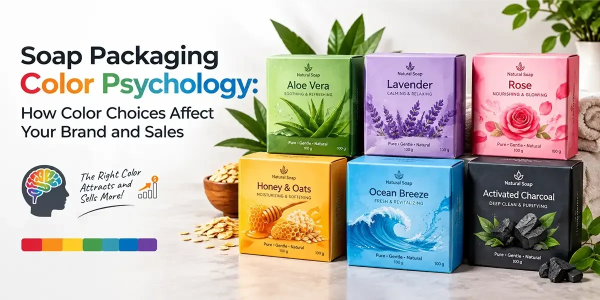
- Key Takeaways!
- Define Your Product Positioning Before Choosing a Soap Packaging Color Palette
- Understand How Common Color Families Are Used to Represent Different Soap Types, Ingredients, and Product Qualities
- Use Color Differences to Clearly Distinguish Each Soap Variant Within the Same Brand
- Match Soap Packaging Colors With the Expectations of Your Target Customer
- Consider How Printing and Packaging Materials Change the Final Color Result
- Select Color Combinations to Keep the Product Name Easy to Recognize
- Apply the Same Core Color Palette Across Soap Boxes, Labels, Displays, and Other Brand Materials
- Review Product, Brand, Printing, and Readability Factors Before Finalizing Soap Box Colors
- Final Thoughts on Using Color to Strengthen Soap Brand Recognition and Sales
- Set the Right Color Direction for Your Soap Boxes With an Experienced Custom Packaging Manufacturer
A soap’s packaging colors can set an immediate expectation about the product before any written information is considered. For example, a pale blue box may suggest freshness and cleanliness, while warm beige can create associations with botanical ingredients, natural formulations, or handmade products. Deeper shades can suggest richness, while softer tones may suit gentle or everyday cleansing products. These associations are not universal rules, but they can influence how shoppers interpret a product when several options are placed together.
For soap manufacturers, skincare businesses, boutique retailers, and personal care brands, choosing packaging colors requires more than selecting a favorite shade. The color needs to relate to the soap itself, the intended customer, the product category, and the position the brand wants to occupy in the market. Soap packaging color psychology provides a useful framework for making these choices effectively.
This guide examines how different color families can shape customer perception, affect brand recognition and sales, and how printing, materials, finishes, and product presentation should be considered before approving a final packaging palette. Let’s explore!
Key Takeaways!
- Choose colors based on the type of soap. Ingredients, fragrance, formula, use, and price can help decide which colors fit the product.
- Colors can give different impressions. Green may suit herbal soaps, while yellow can work for citrus products, but the final effect also depends on the other colors used.
- Use color coding to separate different soap variants. Different shades can help customers identify each fragrance or formula while keeping the same brand style.
- Keep your target customers in mind. Premium, natural, sensitive-skin, and gift soaps may need different color choices to match customer expectations.
- Examine how colors will look when printed. The box material, printing method, and finish can change the final color from what you see on a screen.
- Make sure the text is easy to read. Product names, ingredients, weight, and other important details should have enough contrast against the box color.
- Approve a sample before production. A printed sample lets you see the actual colors, material, and finish before the full order is made.
Define Your Product Positioning Before Choosing a Soap Packaging Color Palette
The same color can communicate something different depending on the soap it represents. A charcoal bar, for example, may suit a cleansing or detox-oriented product, whereas the same dark shade could feel unsuitable for a soap positioned for babies or sensitive skin. Decide how you want customers to see and understand your product. Consider its ingredients, fragrance, intended use, price range, and target customer before selecting specific colors.
A useful starting point is:
Product Characteristics → Customer Expectations → Brand Position → Color Direction → Printing Selection
For example:
- Herbal soap: Greens, muted browns, cream, or botanical combinations
- Citrus soap: Yellow, orange, lime, or fresh complementary shades
- Lavender soap: Lavender, soft purple, white, or muted green
- Charcoal soap: Black, graphite, gray, or restrained neutral combinations
- Moisturizing soap: Cream, blush, soft blue, or warm neutral tones
- Men’s grooming soap: Navy, charcoal, forest green, or deeper earth-inspired shades
- Children’s soap: Friendly combinations with brighter, softer colors
The goal is not to assign one fixed color to every soap category. Instead, the palette should give customers an indication of what kind of product they are looking at.
Understand How Common Color Families Are Used to Represent Different Soap Types, Ingredients, and Product Qualities
Color psychology becomes more useful when it is connected to the product rather than treated as a list of universal meanings. Different color families can establish different associations, but their effect also depends on surrounding shades, typography, printing method, and the material underneath.
Color Family | Common Associations | Soap Categories It Can Suit |
Green | Botanical, fresh, plant-based | Herbal, aloe, tea tree |
Blue | Clean, cool, refreshing | Ocean, moisturizing, fresh scents |
White | Simple, clean, gentle | Sensitive skin, unscented, baby care |
Purple | Floral, calming, aromatic | Lavender, floral blends |
Yellow | Bright, fresh, energetic | Lemon, citrus, summer soaps |
Orange | Warm, lively, fruity | Orange, spice, tropical blends |
Brown | Earthy, raw, ingredient-focused | Coffee, cocoa, handmade soaps |
Black | Rich, strong, contemporary | Charcoal, men’s grooming |
Pink | Soft, delicate, floral | Rose, floral, soft-scented soaps |
Beige | Natural, understated, ingredient-led | Organic, handmade, oat-based |
These associations can help narrow the field, but the final selection should also account for the brand’s existing identity. A company that already uses navy and cream color across its product range may not need to introduce bright green simply because a soap contains botanical ingredients.
Use Color Differences to Clearly Distinguish Each Soap Variant Within the Same Brand
A soap range may contain several fragrances, ingredients, or formulas under one brand name. Using exactly the same packaging color for every variant can make product identification harder, while giving every bar a completely unrelated palette can weaken recognition across the range.
A better approach is to maintain a consistent base color scheme across all variants and assign controlled color differences to individual products.
For example:
Core Brand Color
↓
Shared Typography & Logo Placement
↓
Variant Color
↓
Ingredient or Fragrance Cue
↓
Product Name
A lavender soap might use a soft purple accent, while a lemon bar carries yellow, and a charcoal formula uses grey or black single color boxes. Other packaging details can remain connected by repeating the background, logo design, or typography. This approach is particularly useful for retail shelves where customers may encounter several products from the same range. They can recognize the brand while still identifying the particular formula they want.
Color can also help organize product tiers. A basic everyday soap might use a simple palette, while a specialty collection can use deeper shades or metallic details. The distinction should remain clear without making the product range look disconnected.
Match Soap Packaging Colors With the Expectations of Your Target Customer
Color selection should account for who is most likely to purchase the soap, not simply what the manufacturer likes. Different audiences can respond differently to the same palette because their expectations, purchasing habits, and familiarity with the category vary.
“A color becomes meaningful when it connects the product, the brand, and the customer.”
A skincare customer may respond well to restrained neutrals, deep tones, or carefully controlled metallic accents. Someone shopping for a fresh bath product may respond more readily to cool blues, greens, or citrus shades. A family-oriented soap range may require a friendlier combination that feels approachable without becoming childish.
Consider these customer-focused directions:
For Natural and Ingredient-Led Brands
Soft greens, warm creams, light browns, and earthy colors can suggest a soap made with natural ingredients. Custom Kraft boxes or uncoated stocks may reinforce this direction when appropriate.
For Premium Soap Collections
Deep navy, burgundy, black, ivory, or carefully selected metallic accents can support a higher-priced image. These colors can lead customers to expect a more luxurious soap, higher-quality ingredients, or a more exclusive product experience.
For Gentle or Sensitive Skin Products
Soft blues, creams, whites, and muted greens can communicate simplicity and mildness. Avoiding an excessively busy palette can help keep attention on the product name and key information.
For Youthful or Giftable Collections
Brighter combinations, contrasting accents, or seasonal palettes can suit soaps intended for gifting or younger audiences. These color choices can make the packaging feel more cheerful, playful, or suitable for a particular occasion.
Consider How Printing and Packaging Materials Change the Final Color Result
A color selected on a screen does not automatically reproduce in exactly the same way on every packaging stock. The material, printing process, ink coverage, and surface treatment can all affect the final result.
This is particularly important for custom soap boxes because the same color code may appear different on coated and uncoated boards.
Common printing choices include:
- Digital printing can show slight color changes when the same design is printed on different soap packaging stocks.
- Offset printing can reproduce detailed colors accurately, while the board or paper may affect the final shade.
- Flexographic printing can produce different color results depending on the packaging material and surface.
The board itself also matters. White SBS or coated stocks can produce a different result from natural kraft. If a pale color is printed over kraft, the underlying brown tone can influence the final appearance. This may be useful for an earthy soap range but less appropriate when the brand requires a clean, controlled shade.
Finishing can also alter how a selected color is perceived. Matte lamination gives colors a softer look, while gloss lamination makes them appear brighter. Soft-touch finishes create a smooth surface that can slightly alter how colors look. Foil stamping adds metallic details to selected areas without covering the entire package in metallic color.
Note: For key brand colors, get a sample before full production to make sure the color looks right.
Select Color Combinations to Keep the Product Name Easy to Recognize
Choosing individual colors is only one part of the equation. For example, a soap box may contain a background shade, brand color, product name, ingredient reference, decorative elements, and regulatory information. If every component receives a different color treatment, the package can become difficult to read.
Start with a simple hierarchy of roles without overcomplicating the palette:
Primary Color → Supporting Shade → Accent Color → Text Color
For instance, a sage green background could be paired with cream text and a restrained brown accent for an herbal soap. A navy package could use white lettering with a silver foil detail for a more premium collection.
Try limiting the main packaging palette to a few coordinated shades unless the product concept genuinely requires more. This gives each color a clear purpose.
Contrast is also important. Light text on a pale background can become difficult to read, while dark text on a dark package may disappear into the surrounding design. The product name, variant, weight, and required information should remain clearly readable at the actual printed size.
A good color combination should therefore answer three questions:
- Does it suit the soap type?
- Does it belong to the brand?
- Can customers read the important information easily?
If one answer is no, the palette needs another round of adjustment.
Apply the Same Core Color Palette Across Soap Boxes, Labels, Displays, and Other Brand Materials
Packaging should not exist separately from the rest of the brand. If the company already uses particular colors on its website, labels, retail displays, social media graphics, or promotional materials, introducing a completely unrelated packaging palette can make recognition harder.
This does not mean every surface needs to look identical. Instead, choose a few clear brand elements that can be used across different platforms.
For example, a soap company might use:
- A dark green as its primary brand shade
- Cream as a supporting background
- Gold as a limited accent
- Different secondary colors for individual fragrances
The same framework can then be applied to soap boxes, custom packaging sleeves, inserts, and custom gift boxes.
This becomes especially useful when a business expands its collection. New variants can receive their own secondary shades while maintaining a recognizable connection to the parent brand.
Review Product, Brand, Printing, and Readability Factors Before Finalizing Soap Box Colors
Before approving the soap packaging palette, bring the major considerations together instead of judging color in isolation.
- Define the Product: Identify the soap formula, fragrance, ingredients, and intended use.
- Identify the Buyer: Consider age group, preferences, purchasing setting, and price expectations.
- Set the Brand Direction: Decide whether the range should communicate natural ingredients, premium positioning, everyday care, freshness, gifting, or another clear category.
- Select the Core Palette: Choose a primary shade, supporting color, and limited accent where required.
- Check Variant Differentiation: Make sure each soap can be identified without losing the connection to the wider range.
- Confirm Print Compatibility: Review the selected shades against the chosen board and printing process.
- Check Readability: Examine product names, ingredients, weight, and other required information at the required print size.
- Approve a Proof: Review the physical or approved production proof before committing to the complete order.
This process gives the color decision a clear purpose and reduces the chance of choosing a shade simply because it looks attractive on a screen.
Final Thoughts on Using Color to Strengthen Soap Brand Recognition and Sales
Color is one part of a soap package, but it can influence how shoppers categorize a product, distinguish variants, and remember a brand. The strongest choices come from connecting the palette with the soap formula, target customer, selling environment, and existing brand identity rather than selecting shades at random. Printing method, board type, surface treatment, and text readability also require attention because they can change how the chosen colors appear on the final soap packaging.
Set the Right Color Direction for Your Soap Boxes With an Experienced Custom Packaging Manufacturer
Once the color direction is established, the next step is translating that choice into packaging that suits the product and the brand. BoxLark manufactures custom printed soap boxes with different materials, printing methods, structures, and finishing options, allowing the selected palette to become part of the complete packaging specification.
Prepare the soap names, color references, box size, required details, and finishing preferences, then share them with BoxLark at sales@boxlark.com for a quotation.