


Beyond Orange and Black: Halloween Packaging Color Trends for Brands
Discover how premium packaging transforms your brand's perception and drives customer loyalty in today's competitive market.
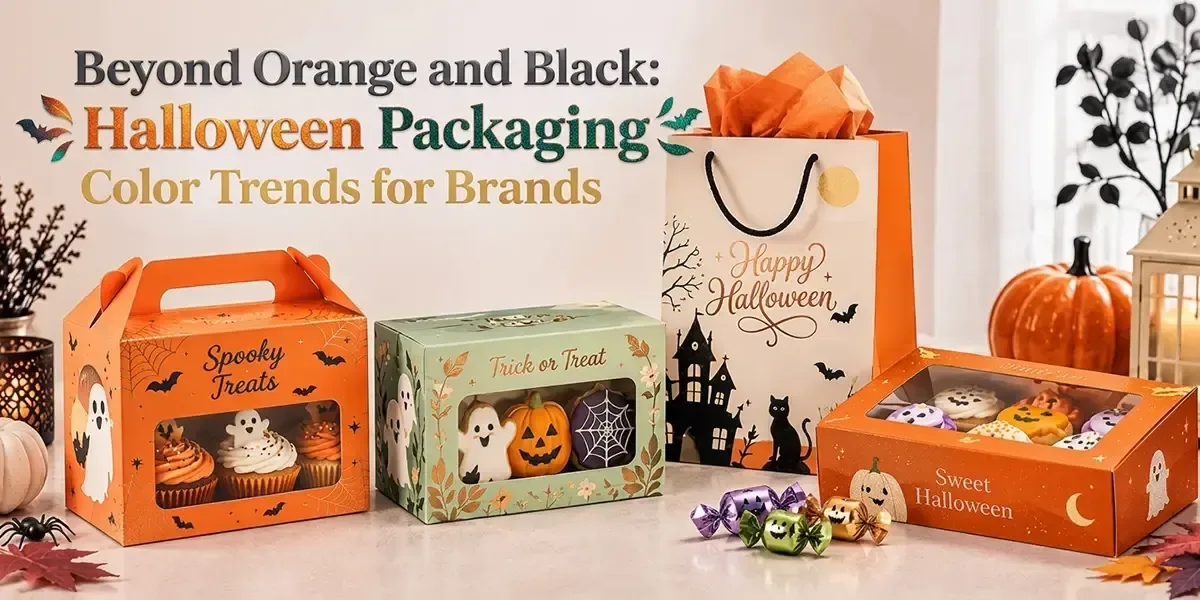
Autumn is just around the corner, which means Halloween is not far behind. As leaves start to change color, retail shelves are also slowly filling up with pumpkins, candy, costumes, and all spooky things. This is the reason brands are looking for a way to give their Halloween product packaging a Halloween makeover, and color is one of the easiest places to get started.
Now here lies a question: Is Halloween packaging only limited to the traditional orange and black hues?
This seasonal packaging has plenty of room for creativity. A seasonal design can be spooky, playful, cute, mysterious, or even a little unexpected, depending on the product and the audience. Orange and black will always have their Halloween charm, but sticking to the same familiar combination every year can make different brands start looking a little too similar.
So, what could Halloween packaging look like beyond the usual palette?
From Halloween packaging ideas to less expected shades, there is plenty of room to experiment. Let’s explore some color ideas that bring something a little different to seasonal packaging.
Let’s get spooky right away!
Key Takeaways!
- Orange and black are classics, not rules, when it comes to Halloween packaging colors.
- The right palette can make a product feel spooky, cute, playful, or mysterious.
- A simple color change can give a familiar product a whole Halloween look.
- Soft, dark, bright, and unexpected shades can all work for the season.
- Pastels, deep shades, neutrals, and neon tones can all give Halloween a different look.
- A seasonal palette can make the same product feel completely different from its everyday version.
Why Color Is a Big Part of the Halloween Packaging Experience
Halloween is one of those seasons where color can change the whole feel of a product. A regular product can suddenly look spooky, playful, magical, or even a little creepy just by changing its color scheme.
Customers do not need to read a long label to get the idea.
One look can tell them, “Yep, this is for Halloween.”
Color Helps Seasonal Products Get Noticed
A noticeable change in color can help shoppers recognize the seasonal edition at a glance, especially when it is placed beside the regular range.
A few simple choices can help:
- High contrast: Makes text and graphics easier to notice.
- Seasonal color shifts: Make the Halloween version easier to distinguish.
- Unexpected shades: Give familiar designs a different look.
- Branding consistency: Keep familiar logos and product elements recognizable.
For example, a chocolate brand could switch from cream or brown to black with cherry red details for a Halloween release. With custom chocolate boxes, that simple color change can make the seasonal version easier to spot and support a stronger seasonal product presentation.
From Classic Halloween Colors to Newer Palettes
Orange, black, purple, green, red, and white are familiar Halloween colors, but brands do not have to use them in the same old combinations. Changing the shade or pairing a classic color with something unexpected can give seasonal packaging a whole new direction. This is where a Halloween color palette can move beyond the expected combinations.
Classic Color | Alternative Shade or Pairing | Direction |
Orange | Burnt orange, peach | Softer and autumn-inspired |
Black | Charcoal, midnight blue | Dark but less predictable |
Purple | Plum, dusty purple | Richer and more refined |
Green | Sage, forest green | Natural or witchy |
Red | Cherry red, burgundy | Dramatic and gothic |
White | Ivory, cream | Soft and understated |
These small shifts give brands more room to experiment while keeping the Halloween connection clear. The result does not have to look completely different from the usual brand packaging.
Sometimes, changing the shade or adding one unexpected color is enough to give a familiar design a seasonal twist.
Halloween Packaging Color Ideas for Brands That Should Try Something Beyond Orange and Black
Brands can play with different shades and combinations to give their seasonal packaging a new personality. Here are some color ideas to try.
1. Gothic Reds for a Darker Halloween
Palette: Cherry Red | Burgundy | Black | Silver
Deep reds can give Halloween packaging a darker, more dramatic feel without relying on the usual orange. Cherry red and burgundy work especially well with black, while silver adds a sharp contrast.
This palette suits Dracula-inspired designs, gothic themes, horror products, and luxury seasonal treats. A coffin box could use a black base with burgundy panels, cherry red details, and silver typography for a Halloween collection that feels dark without looking overly busy.
2. Halloween Is Borrowing From Autumn
Palette: Burnt Orange | Cream | Brown | Burgundy
Halloween and autumn already share plenty of visual cues, so brands can blend the two instead of making the packaging look purely spooky. Burnt orange, cream, brown, and burgundy create a warmer seasonal palette that works well with pumpkins, leaves, and other autumn-inspired artwork.
This approach can suit food, coffee, baked goods, and gift packaging. A custom bakery box could use a cream base with burnt orange illustrations, brown typography, and small burgundy details for a Halloween look that still feels natural to the brand.
3. Pastel Halloween Gives Regular Packaging a Cute Twist
Palette: Pastel Purple | Pink | Peach | Mint | Black
Halloween packaging does not always need dark colors. Pastel shades can give regular packaging a fun Halloween touch while keeping the design light and playful.
Brands can keep their usual packaging and add pastel purple, pink, peach, or mint with small Halloween details like ghosts, pumpkins, bats, or stars. Custom toy boxes can use this idea to make their regular packaging feel ready for Halloween without changing its whole look.
This is one of the more creative Halloween packaging directions for brands that want something softer.
4. Midnight Blue Creates a Moonlit Look
Palette: Midnight Blue | Black | Silver | Cream
Midnight blue offers a darker alternative to black while keeping the mysterious side of Halloween. Paired with silver or cream, it can depict moonlight, night skies, stars, and a slightly magical atmosphere.
This palette can work well for premium products, gift sets, skincare, and nighttime-themed collections. A custom gift box in midnight blue with silver stars and cream typography could create a Halloween look without using the traditional orange palette.
5. Neon Brings a Funky Halloween Energy
Palette: Neon Green | Bright Purple | Electric Blue | Black
Neon colors take Halloween in a louder direction. Neon green, bright purple, and electric blue against black can create an energetic look that feels more like a Halloween party than a haunted house.
This trend fits gaming products, drinks, candy, and youth-focused brands. For example, custom play card boxes could use black with neon graphics, monsters, slime, or lightning for a limited October design that feels fun and bold.
6. Earthy Tones Halloween Dials Back the Drama
Palette: Ivory | Beige | Charcoal | Brown
Some brands may want a Halloween connection without completely changing their visual identity. Neutral-toned palettes can do that through small seasonal details, subtle illustrations, and darker accents.
This approach works particularly well for handmade products, home goods, premium collections, and brands that already use minimal packaging. Kraft boxes can pair naturally with ivory, beige, charcoal, and brown, while small ghosts, moons, or botanical illustrations add just enough Halloween character.
7. Classic Orange Gets a Softer Update
Palette: Soft Orange | Cream | Brown | Muted Green
Orange does not have to disappear just because brands are exploring new Halloween palettes. Softer orange paired with cream, brown, and muted green can make the familiar color feel calmer and more autumn-inspired.
This direction can work for coffee, food, bakery, and seasonal gift products. A mailer box or 2 piece box could use a cream background with soft orange graphics, brown typography, and muted green leaves for a Halloween design that feels seasonal without going overboard.
At the end of the day, there is no single color palette that works for every Halloween product. Some brands may want a dark and dramatic look, while others may prefer something cute, warm, bold, or minimal. The key is to choose colors that fit the product and give the packaging a clear Halloween connection without losing the brand’s usual look.
Common Halloween Packaging Color Mistakes That Can Throw Off Your Entire Design
Halloween gives brands plenty of room to experiment, but even a fun idea can go sideways when the colors start fighting for attention. Before finalizing a seasonal palette, learn a few common design mistakes:
- Do not create harsh color clashes: Some bright shades look fine on their own but become overwhelming when placed together. Test the full palette before using it across the packaging.
- Do not overlook the background: A strong background color affects everything placed on top of it. If the background is loud, simpler graphics may work better.
- Do not make every element equally bold: If the logo, artwork, text, and decorative details all use strong colors, nothing gets clear attention. Give one or two elements the lead.
- Do not forget the top coating: The same color can look different on matte, glossy, or textured packaging. Check how the chosen shades will actually appear on the final material.
For example, bright purple, neon green, and electric blue may create a fun Halloween look, but using all three at full intensity across the entire package could feel overwhelming. Using one as the main color and keeping the others for small details can make the design more balanced.
Closing Remarks!
Halloween is anything but boring, and your packaging should get the memo. From witches and vampires to ghosts and autumn-inspired themes, different concepts open the door to completely different color choices. These small changes can make a familiar product feel new and give customers another reason to pause when they spot it.
“Give the Typical Halloween Colors a Break and Let Your Packaging Try Something New!”
The goal is not to fill the package with every Halloween color you can find. Pick a direction and build around it, keeping enough breathing room for the product, brand, and key details. A strong palette should feel festive without becoming overwhelming. It should catch the eye, spark curiosity, and make the seasonal version feel worth picking up.
So, this Halloween season, collaborate with BoxLark and turn your ideas into custom packaging made based on your product and campaign.